Eighty-seven years of work, finally easy to look through.
Demaine Partnership is a Melbourne architecture practice founded in 1938, working across apartments, houses, aged care, retirement, education, recreation and commercial. We rebuilt its website as a portfolio the practice publishes to itself — where the buildings do the talking and the architects stay in control of the content.
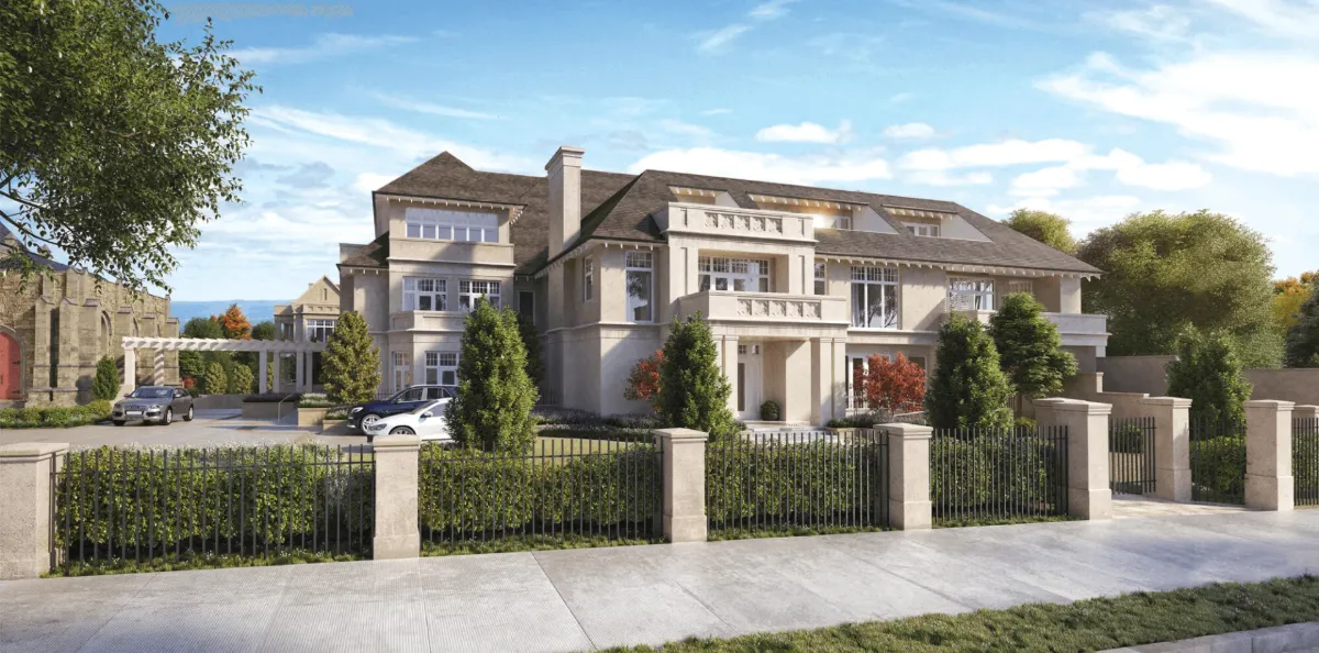
A practice whose archive was bigger than its website.
- Client
- Demaine Partnership
- Sector
- Architecture, Melbourne
- Platform
- WordPress
- Engagement
- Eleven weeks, fixed scope
Demaine Partnership was founded in 1938 and began in hospital design. It has since built across apartments, houses, recreation, retirement, aged care, education and commercial, alongside interiors and urban design. That is nine sectors, decades of completed buildings, and a body of work most competitors cannot match.
None of that was visible. Projects sat in flat category lists, images were uploaded at full camera resolution, and a prospective client researching aged care had no way to see the practice’s depth in that sector without opening a dozen pages.
The brief was to make the portfolio do the selling: let a developer, a school board or a homeowner see relevant, comparable work in under a minute, and let the practice add a project without waiting on anyone.
A portfolio site where the portfolio was the weakest part.
Analytics showed people landing on a project, looking at one image and leaving. Sessions rarely reached a second project, which for an architecture practice is the whole point of the site.
- {{ c }}
Sector first, project second, image everywhere.
We started in the archive rather than the homepage. Two weeks with the directors, going through completed projects and asking a single question of each: who is this the proof for?
{{ a.t }}
{{ a.d }}
A gallery-quiet interface, so the buildings carry it.
Architecture sites fail when the interface competes with the work. We stripped the chrome back to a restrained type scale and generous whitespace, then let full-bleed project photography do the rest.
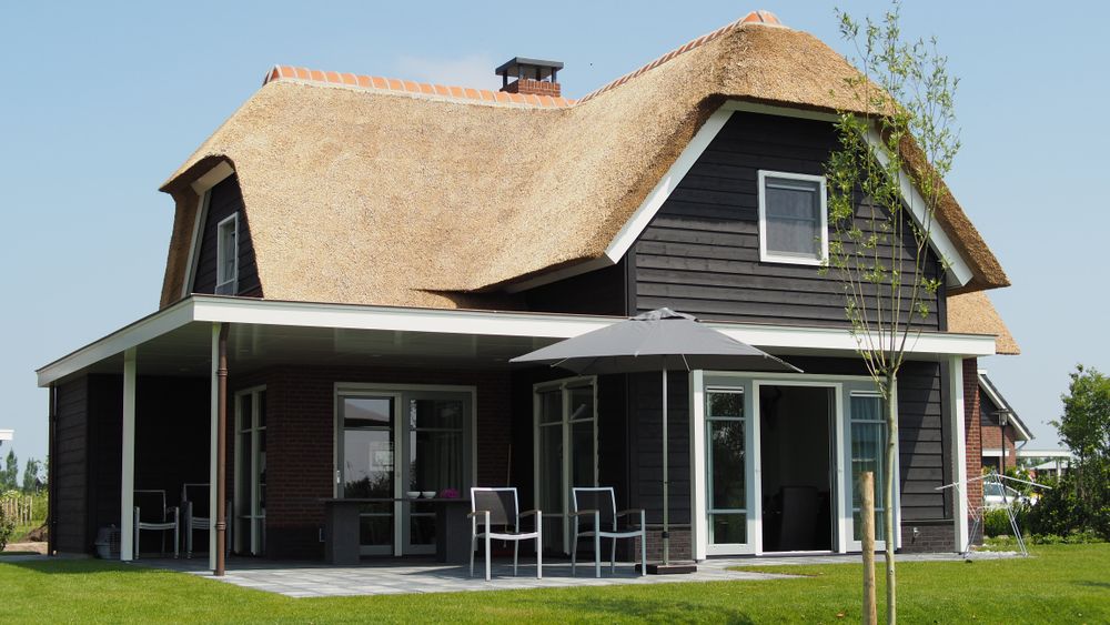

What we built into the site.
Each feature earns its place by getting a visitor from one relevant project to the next without thinking about it.
{{ f.t }}
{{ f.d }}
Half the audience is scrolling a portfolio on a train.
Large photography and mobile data are natural enemies. Every template was designed at 375px first, images are served responsively at a fraction of their original weight, and the nine-item sector menu became a flat list instead of a nested dropdown that never worked on touch.
- {{ m }}
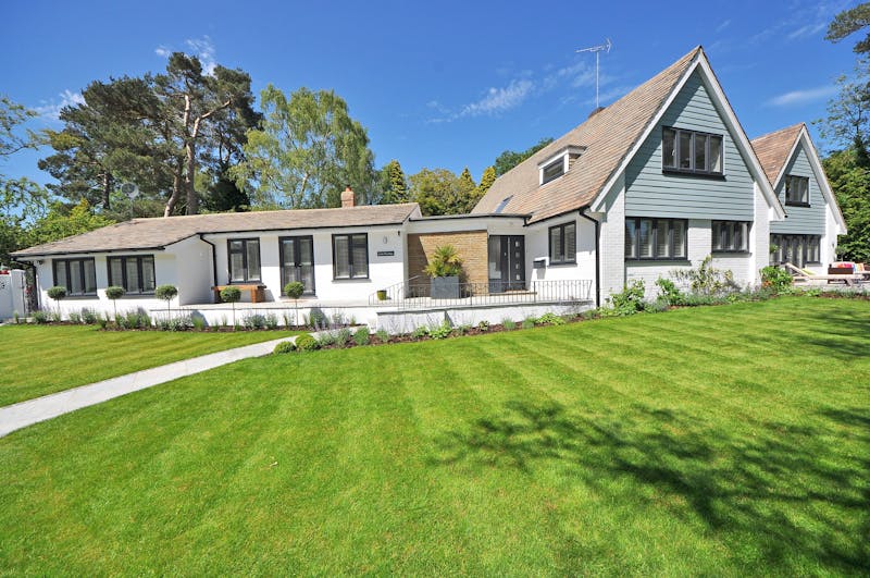
One team, start to finish.
The people who sat in the archive with the directors are the people who designed, built and now support the site.
People now look at four projects, not one.
Measured over the first three months against the same period on the previous site. The practice now publishes completed projects itself, usually the week they are photographed.
“Clients arrive at the first meeting having already seen four or five relevant projects. The conversation starts somewhere much further along than it used to.”